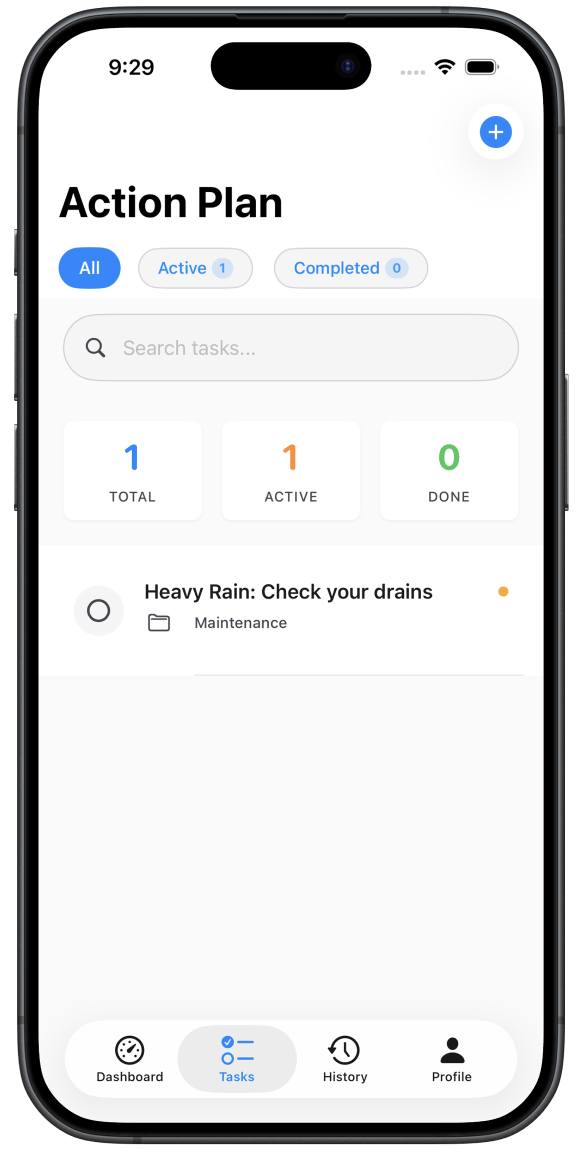
AI-powered home protection · 2025 Fluxatathon · 1st Place
🏆Sentinel won the 2025 Fluxatathon competition, judged by SCAD alumni and Google UX Designers.
AI IntegrationMobile AppConnected System
Sentinel
My team and I were tasked with designing an AI-powered home protection app that gives homeowners a proactive view of their home's vulnerability to weather-related damage — built to feel high-end, intelligent, and trustworthy.
Team Lead
48 Hours
3 Members
2025
The Problem
We manage our biggest asset on a gut feeling.
The question every homeowner asks
"Is it time to replace the roof?"
The reality without data
A $100 inspection becomes a $200,000 disaster.
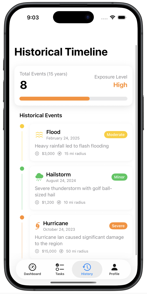
Homeowners have no reliable way to know what their home has actually been through. Weather erodes materials faster than age alone suggests — but no tool existed to translate a home's storm history into an actionable maintenance plan.
How do we help home owners be prepared and protected from future weather related wear and tear, in 24 hours?
Design Process
A comprehensive UX approach from discovery to delivery
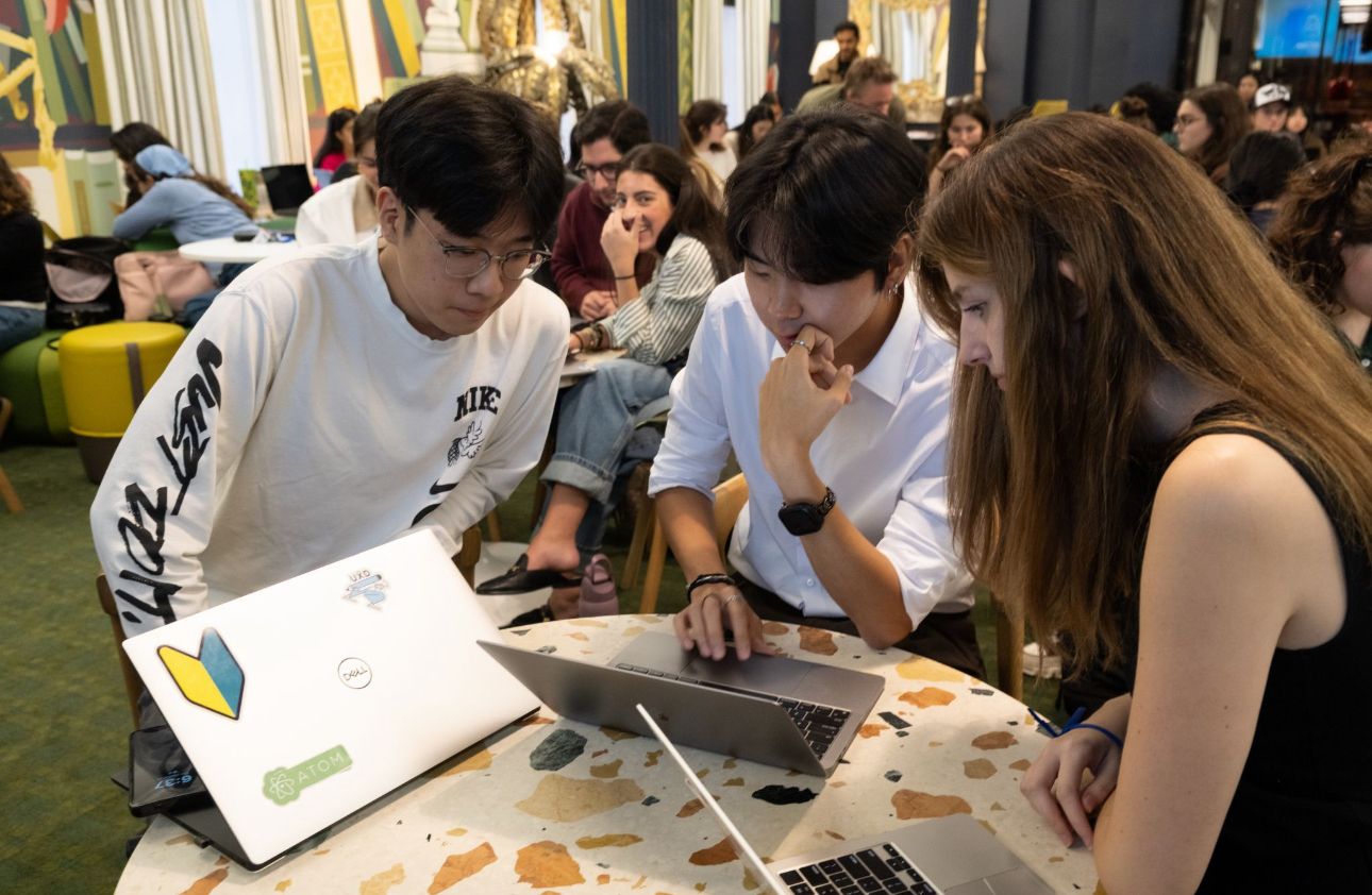
With only 48 hours, we made a deliberate choice — spend 30 of them on research. A beautiful design built on weak insights is worthless.
🔍
Research
🎯
Define
💡
Ideate
📱
Prototype
✅
Test
User Persona
Meet Alex
Alex
Age 35 · Doctor · New Homeowner
Strengths
Hard worker, Energetic
Weaknesses
Easily distracted, low executive functioning
Alex just moved into his new home, built in 2010. While he loves the house, he's worried — it's in an area known for severe storms, and he has no idea what the roof and exterior have already been through. Alex needs to stop guessing about his home's true condition and find a way to proactively prevent future, costly storm damage.
Motivation
Stay on top of home maintenance without it consuming his time
Core Needs
Time & task management, a healthy and balanced routine
Pain Points
Hard time remembering maintenance tasks amid a busy schedule
The Key Insight
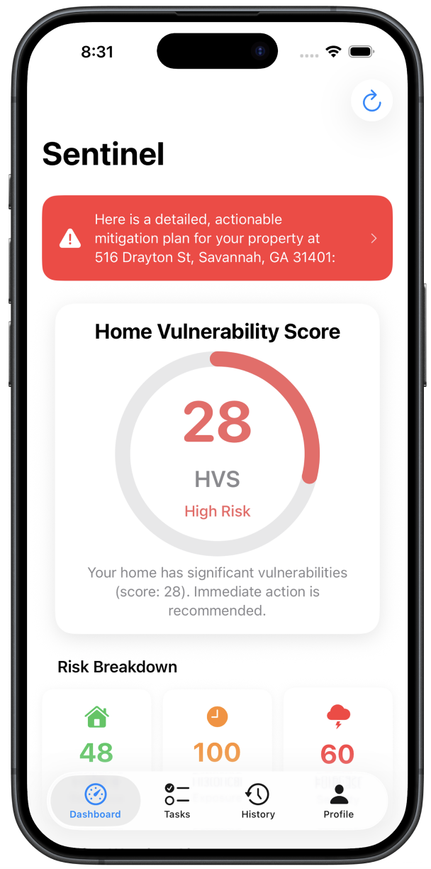
A "20-year" roof can be 15 years old — in real terms.
The number of years a home has existed tells you almost nothing. What matters is what it's been through. Our model can show an address that experienced severe weather events and reveal its true structural lifespan — years shorter than the manufacturer's rating.
Assumed Lifespan
20
years (manufacturer rating)
True Lifespan (Sentinel)
15
years based on actual weather exposure
Research & Discovery
Understanding homeowner anxiety
Research Methods
For this project my team focused on testing homeowners ages 19–75 from across the US to get a heuristic view on their concerns.
User Interviews15 in-depth interviews with active homeowners
Surveys20 responses from homeowners across the US
User Personas2 User Personas developed
Key Insights
What users actually told us
Three consistent themes emerged across all 15 interviews and 20 survey responses — each one directly shaping a core feature of the final design.
Users Value
The ability to predict when maintenance is needed based on data from past weather and seasonal changes.
Users Need
To save the time and money that would be spent on reactive emergency repairs.
Users Want
The reassurance of another party looking out for them and their home 24/7.
Why Now
Climate volatility is the new normal.
Weather disasters have increased dramatically since 1980 — what was once a rare event is now an annual reality for millions of homeowners. The gap between what people assume about their home's condition and what's actually true has never been wider.
Annual weather disasters
~3
per year in 1980
Annual weather disasters
28+
per year by 2024
Ideation & Wireframing
Simplicity under pressure
Based on research insights, we brainstormed solutions and created wireframes to test different approaches to the information architecture and layout.
Low-Fidelity Wireframes
We focused on a simplistic design due to the high amount of information that needed to be displayed.
Design Workshop
The team spent 30 of the 48 hours on research and ideation — the design means nothing if it's not built on a strong foundation.
Our Core Values
Two principles, one product.
Value #1
Predictive Maintenance
Move from React & Repair to Plan & Maintain — using weather data to predict what needs attention before it breaks.
Value #2
Proactive Prevention
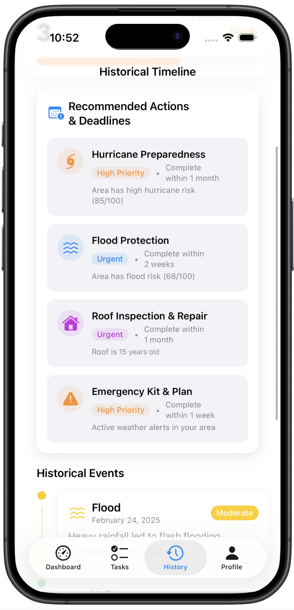
Give homeowners active weather alerts and auto-generated action plans — so they act before a storm causes damage, not after.
Results & Impact
First place.
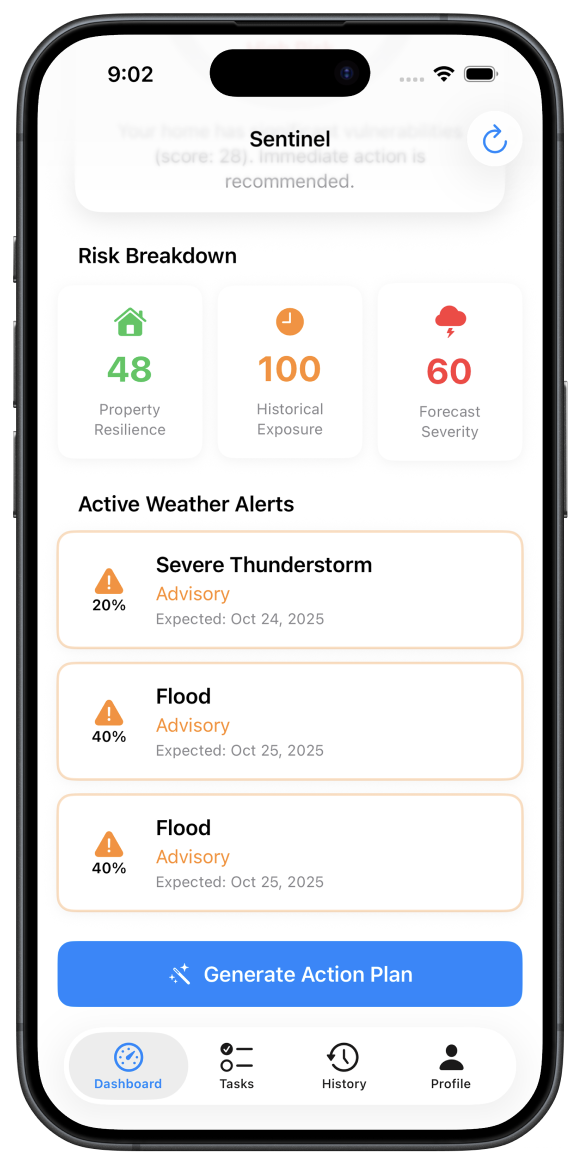
Sentinel successfully uses real weather data so homeowners can put their energy into things that matter instead of worrying about their home.
Judges praised the research depth and the clarity of the Home Vulnerability Score as a single, digestible metric that made a complex problem feel manageable.
Let's Connect
Interested in working together?
Let's discuss how I can help improve your product's user experience.
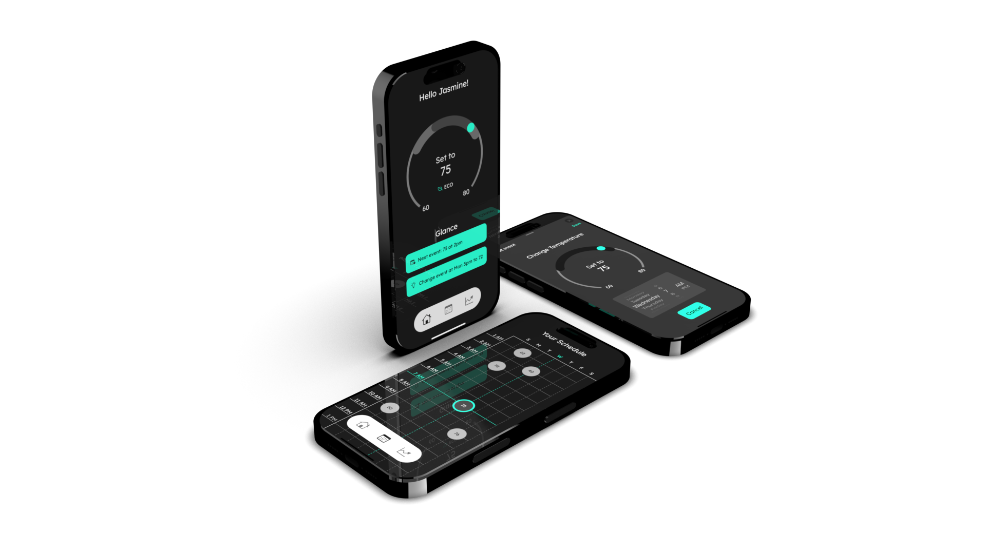
A full ecosystem redesign of the Google Nest Thermostat and companion app — grounded in a systematic moodboard research study and validated through two rounds of user testing. The goal: make the Nest feel genuinely premium, not just functional.
Simply put — less is more.
Research Lead
10 Weeks
7 Members
2025
The Problem
The Nest lacks a defined high-end identity.
The Nest thermostat and app exist in spaces designed to feel luxurious — but the product itself doesn't match that environment. Before redesigning, we needed to understand exactly what "high-end and innovative" means visually, so every decision could be grounded in data rather than taste.
How do we redesign the Nest Thermostat ecosystem to embody the feeling of being high-end and innovative?
Research at Scale
The moodboard study behind the directives
600+Images Collected
68Final Moodboard Images
36Visual Traits Analyzed
10Final Directives
10User Tests Conducted
5Final Directive Images
Design Process
From moodboards to a tested ecosystem
Each team member collected 60 moodboard images individually, narrowed to the strongest 20, then cross-tabulated 36 visual traits across the full set to surface data-backed directives before a single design decision was made.
🔍
Individual Moodboarding
🧪
Collating & User Testing
🎯
Finalize Moodboards
📊
Tabulation & Directives
✅
Top 5 Images & Presentation
Findings
10 Design Directives
Each directive emerged from frequency analysis across 68 curated images. High-end design favors restraint, geometry, and purposeful darkness. The data was unambiguous.
01
Sans-Serif Typeface
02
Regular Body Text
03
Limited UI Elements
04
Curvilinear Design Elements
05
2:1 or 3:1 Headline Ratio
06
Minimalistic Design
07
White Lettering
08
Soft Lighting
09
Geometric Lettering
10
Low Icon Weight
The Design
Three principles that shaped every screen
01
Simplicity — one element at a time
The thermostat's small circular screen called for simplicity at the forefront of every decision. We used a consistent split-screen display — interactable menus on the left, display on the right — so the user is only ever changing one element per screen. The app used its larger canvas to show all related controls at once.
02
Navigation that removes confusion
We used words over icons on the thermostat to eliminate ambiguity, and always showed the full context of where the user is in their journey. Every screen answers "where am I and what am I changing?" before asking anything of the user.
03
A consistent visual ecosystem
The same colors, components, and visual treatments appear across both the thermostat and the app. Temperature bubbles in the schedule look identical on both devices. The ecosystem feels like a single product, not two separate interfaces.
User Testing
Two rounds. Measurable improvement.
We used interviews and the SUS (System Usability Scale) questionnaire across two rounds of testing — one for the thermostat and one for the app — with measurable increases in both task completion and usability scores each round.
Thermostat
+23%
task completion increase, final round
+10.4%
SUS score increase, final round
60%
avg tasks successfully & easily completed
68.75
avg SUS score
App
+29%
task completion increase, final round
+6.67%
SUS score increase, final round
54%
avg tasks successfully & easily completed
65.83
avg SUS score
"32% of people would stop interacting with a brand after one bad experience."
— PWC, 2020
Visual Identity
Color & typography
The redesign uses Lexend Deca across all weights — a typeface chosen for its geometric clarity and legibility on small screens. The color palette is built around aquamarine, chosen for its associations with calm, openness, and the premium spaces the Nest inhabits.
Aquamarine#5BFEDE
Battleship Grey#929292
Platinum#E0E0E0
White#FFFFFF
"Aquamarine communicates feelings of openness, calm, tranquility and relaxation — something these homes also aim to exude."
Final Result
The redesigned ecosystem
The finished Nest redesign — thermostat and companion app — as a unified, high-end experience grounded in research and validated through two rounds of user testing.
Let's Connect
Interested in working together?
Let's discuss how I can help improve your product's user experience.
Mayo Clinic × SCAD PRO
Lead UX Designer · 10 Weeks · 2024
UX Design · UX Research · Graphic Design
🔒
This project is under NDA
The full case study, including detailed process work, deliverables, and outcomes, is protected by a non-disclosure agreement with Mayo Clinic. What's shown here is a high-level overview only. Happy to discuss further in conversation.
UX DesignUX ResearchGraphic Design
Mayo Clinic × SCAD PRO
Collaborated with The Mayo Clinic to redesign a nursing award — connecting the community and recognising staff through thoughtful, human-centered design.
Lead UX Designer
10 Weeks
15 Members
2024
Design Process
A comprehensive UX approach from discovery to delivery
🔍
Research
🎯
Define
💡
Ideate
📱
Prototype
✅
Test
Key Insights
What the research revealed
15 User Interviews
In-depth sessions with nursing staff to understand what recognition means to them and what makes an award feel meaningful.
Community Connection
Award redesign focused on peer nomination and storytelling to build belonging — recognition that comes from colleagues carries more weight than recognition from above.
Let's Connect
Want to know more?
I'm happy to walk through this project in more detail during a conversation. Get in touch and we'll find a time.

 ◆
Accessibility Designer ◆
◆
Accessibility Designer ◆
 ◆
Product Design ◆
◆
Product Design ◆
 ◆
Graphic Designer ◆
Interaction Design ◆
UX Researcher ◆
◆
Graphic Designer ◆
Interaction Design ◆
UX Researcher ◆
.png)

.png)
.png)
.png)
.png)